Node Visual Customization
This document explains how to customize the visual appearance of nodes in Joint, allowing you to create a more personalized and engaging user experience.
Customizing Node Appearance
Joint allows you to customize the appearance of nodes.
From some basic stuffs like, the color of the body of the node and custom icon...
...to the material and shape of the node!
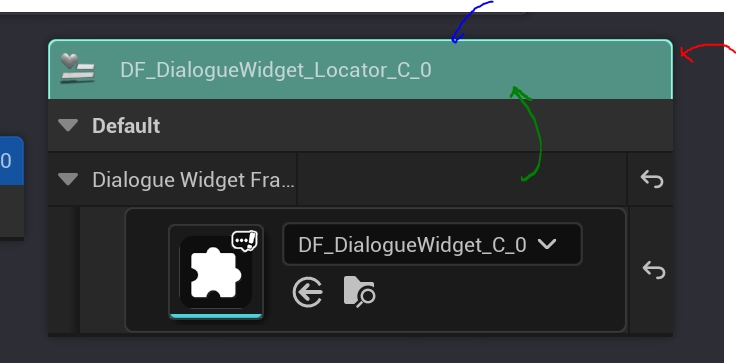
You can start customizing the appearance of your nodes by opening the BP editor for your node class.
Then, in the "Class Settings" tab, you will find various properties related to node appearance in the "Details" panel.
You can open the BP editor for your node by pressing the "Open Editor" button in the Joint Node Details panel.
Common
These properties are common settings for node appearance. With those properties, you can specify the color of the node it will use on the search tab, whether to show the class friendly name hint, and the default detail level of the node.
| Property | Description / Notes |
|---|---|
NodeIconicColor | Iconic color used for identification (search tab, etc.). |
bAllowDisplayClassFriendlyNameText | Show class friendly name hint next to iconic node when detail level is not SlateDetailLevel_Maximum. (When it is stowed. if it's set to false, it will display the name of the class instead) |
bUseSimplifiedDisplayClassFriendlyNameText | Use SimplifiedClassFriendlyNameText instead of the original friendly name on the graph node. |
SimplifiedClassFriendlyNameText | The simplified friendly name to display when enabled. |
DefaultEdSlateDetailLevel | Default slate detail level used by the graph node. |
NodeIconicColor is used to represent the iconic color of the node in various places, such as the search tab. (It's the color of the sphere icon next to the node name in the search tab)
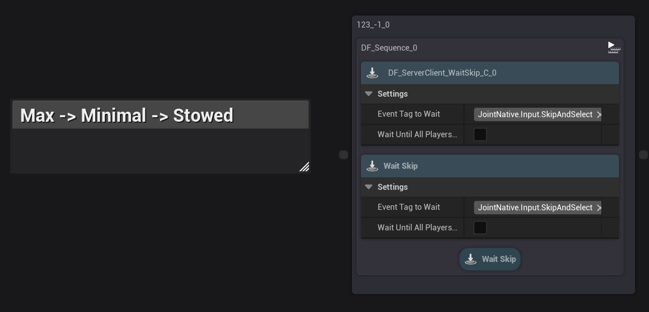
EdSlateDetailLevel defines how much detail is shown on the node in the graph editor.
We provide "Max", "Minimal", and "Stowed":
- Max mode shows all details of the node.
- Minimal mode is quite similar to Max mode, but it displays the name of the class instead of the friendly name hint next to the iconic node.
- Stowed mode hides all the widgets on the node, showing only the iconic node and name of the class.
Node Iconic Nodes
In this section, you can customize the appearance of the iconic node shown in the top left corner of the node.
| Property | Type | Description / Notes |
|---|---|---|
IconicNodeImageBrush | FSlateBrush | Brush image shown inside the iconic node (small colored block). |
Since it uses FSlateBrush, you can use material brushes to create more complex and dynamic visuals for your iconic nodes, just like the image above.
Node Body Customization
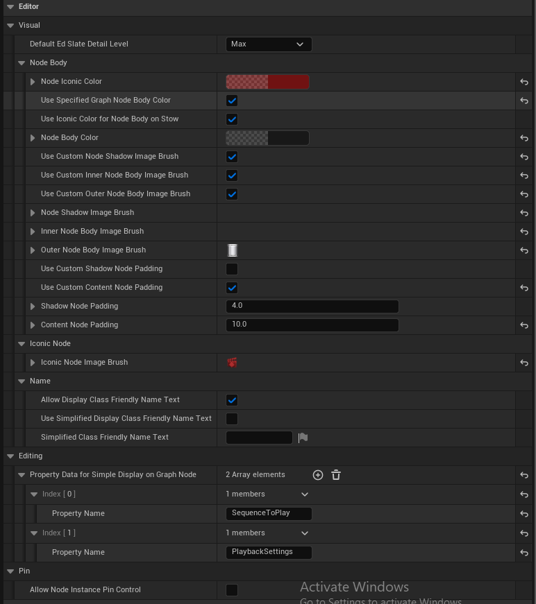
You can customize the visual of the body of your nodes by modifying the following properties:
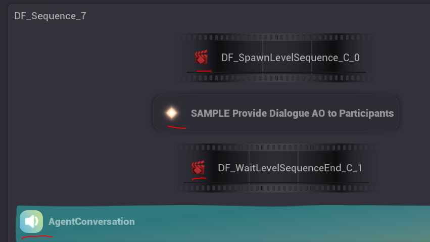
Here is a video of one example result of customizing the node body using those properties:
The properties that are shown in the video are changed or renamed in the later versions of Joint, so the exact property names may differ from what is shown in the video.
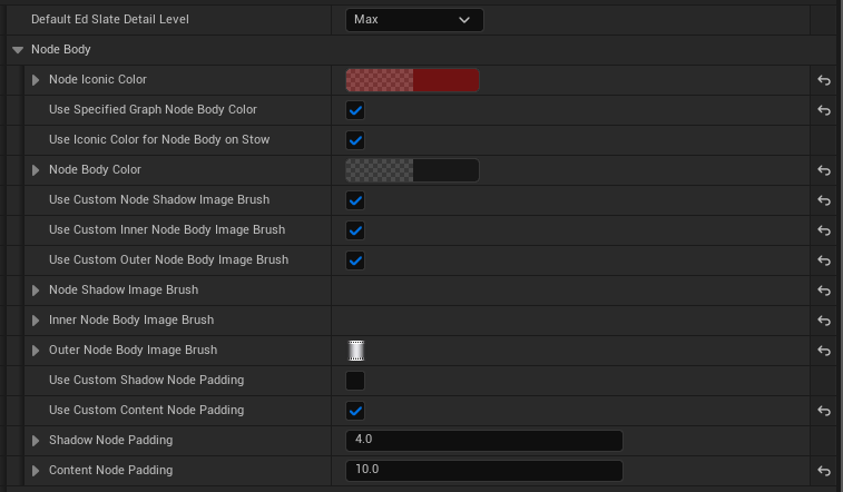
Joint's node body is made up of 3 layers: shadow, outer body, and inner body. By customizing each layer using the properties above, you can create unique and visually appealing node designs.
In this image below, Red arrow indicates the shadow layer, Blue arrow indicates the outer body layer, and Green arrow indicates the inner body layer.
If you want, you can even hide certain layers by setting the DrawAs property of the corresponding brush to NoDrawType.
| Property | Description / Notes |
|---|---|
bUseSpecifiedGraphNodeBodyColor | If true, use NodeBodyColor; if false, use common node body color scheme. |
bUseIconicColorForNodeBodyOnStow | When stowed, use NodeIconicColor for body; set false to keep NodeBodyColor. |
NodeBodyColor | Primary color for the node body. |
bUseCustomNodeShadowImageBrush | Use NodeShadowImageBrush instead of default. To hide shadow set brush DrawAs to NoDrawType. |
bUseCustomInnerNodeBodyImageBrush | Use InnerNodeBodyImageBrush instead of default. To hide inner body set brush DrawAs to NoDrawType. |
bUseCustomOuterNodeBodyImageBrush | Use OuterNodeBodyImageBrush instead of default. To hide outer body set brush DrawAs to NoDrawType. |
NodeShadowImageBrush | Brush used for node shadow (used if bUseCustomNodeShadowImageBrush is true). |
InnerNodeBodyImageBrush | Brush for inner node body (used if bUseCustomInnerNodeBodyImageBrush is true). |
OuterNodeBodyImageBrush | Brush for outer node body (used if bUseCustomOuterNodeBodyImageBrush is true). |
bUseCustomShadowNodePadding | If true, use ShadowNodePadding instead of default shadow padding. |
bUseCustomContentNodePadding | If true, use ContentNodePadding instead of default content padding. |
ShadowNodePadding | Custom padding around the shadow when bUseCustomShadowNodePadding is true. |
ContentNodePadding | Custom padding for node content when bUseCustomContentNodePadding is true. |
Utilizing Simple Property Display
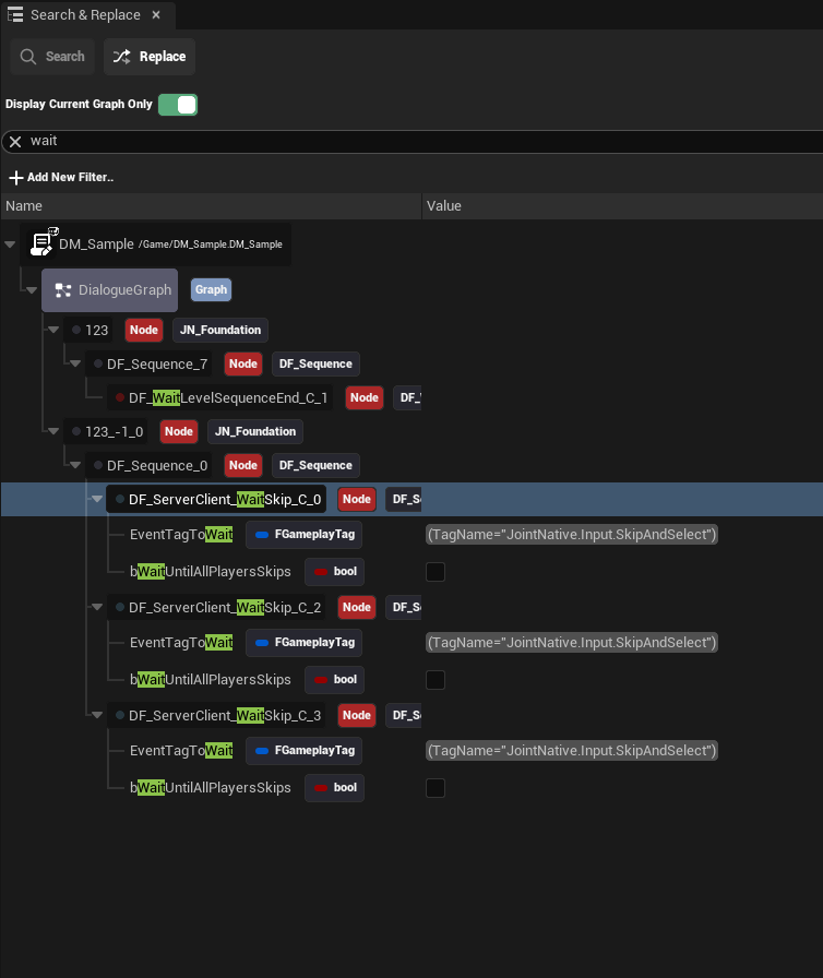
Joint provides a way to expose the specified properties of your nodes on the graph node slate via Simple Property Display.
This feature allows you to quickly access and check out important properties without clicking nodes one by one - enhancing usability and efficiency when working with complex graphs.
Please refer to the Simple Property Display guide for detailed instructions on utilizing Simple Property Display.
Utilizing Custom Editor Node Class
The method described above allows you to quickly iterate on node appearance and
To maximize visual customization, you can create a custom editor node class by extending the UJointEdGraphNode class.
Please refer to the Making New Editor Node guide for detailed instructions on creating a custom editor node class.