Styling Context Texts and Text Holder Widget
This document assumes an understanding of the Unreal Engine's Rich Text system. The Simple Dialogue System's text styling system utilizes the Unreal Engine's Rich Text system, and the provided editor focuses on making this system easier to use. Refer to the following document for an understanding of the Unreal Engine Rich Text System
The Context Text Editor is an editor that makes it easier to add decorations to the text in the Context Text property of nodes based on Dialogue Node Base Context.
Let's learn how to use this Context Text Editor.
Context Text Editor And Text Style Table
Brief Explanations for the Each Section of the Context Text Editor.
Add a Dialogue Node Base Context-based node to the graph of the Dialogue Manager. In this example, we will use a Monologue Node.
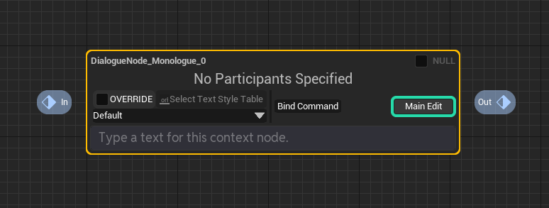
Above the text box for modifying the Context Text, you will see various additional buttons. Among them, we will focus on the buttons in the first section.
Brief descriptions for each section is as following (We will look at it further at below) :
| Visual | Description |
|---|---|
| Checkbox to determine whether to use the default asset of the Dialogue Manager for the text style table applied to this text block or override it with specific text style table asset. | |
| Button to select the asset to override the text style table for this text block when the OVERRIDE checkbox is checked. | |
| ComboBox to choose the style to apply to the text segment. |
Additionally, by pressing the button labeled "Main Edit" on the far right of the node, you can switch the view mode of the text editor to Raw Edit mode, showing all markup decorators for direct editing. This is helpful when you want to directly modify markup decorators. We will explore this in detail below.
Now, let's learn how to use each button.
Styling Text with the Context Text Editor
First, let's input a line for the Monologue Node we created earlier. In this example, we'll use the text "Context Text Editor Example References."
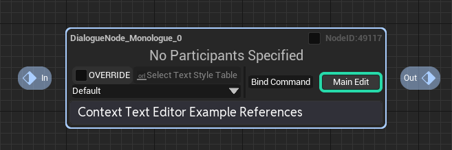
Once you've filled it out, use the mouse to drag and select the portion of the text you want to apply a style.
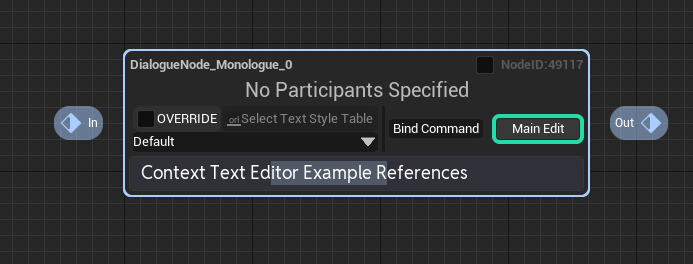
Then, click on the ComboBox labeled "Default", as explained in (3) in the components part.
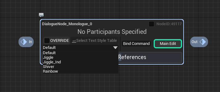
You'll see a list of styling options to choose from the text style table assigned to this dialogue. Now, select the styling you want. In this example, we'll choose "Rainbow."
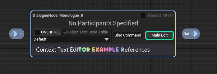
Now, you can see that the selected portion of the text has been styled with the chosen text style.
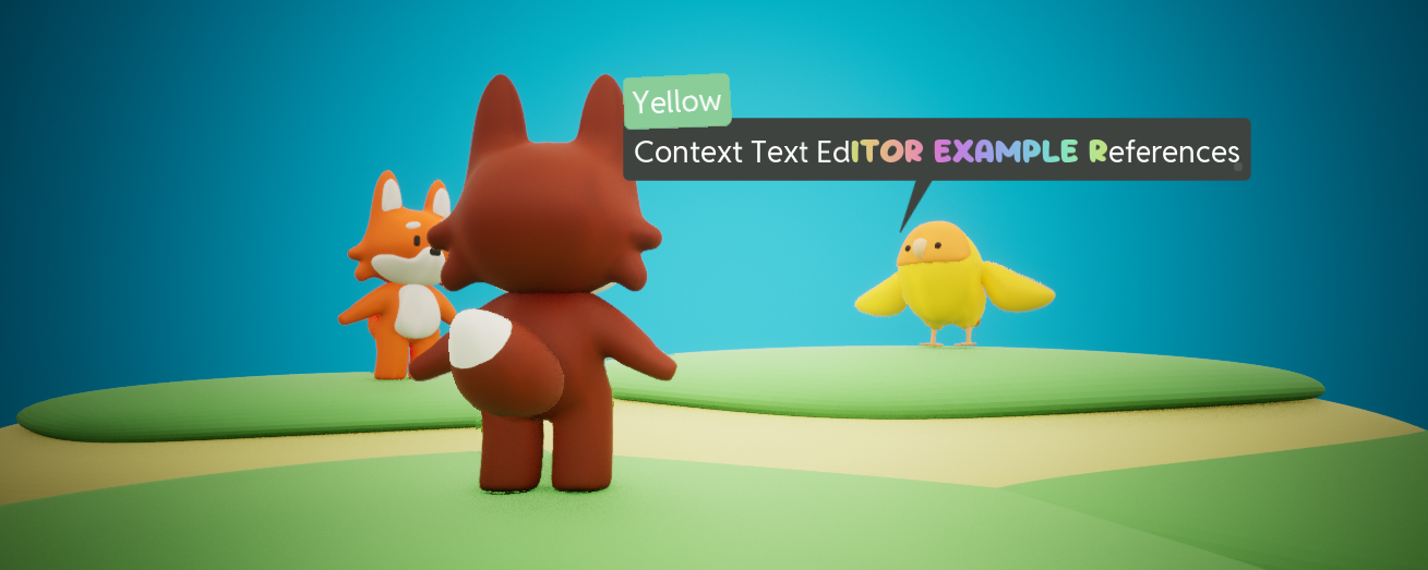
If you run it on the PIE, you will see the text is being stylized as we stylied.
Creating Text Styles
Definately, You will need to add your own text style.
By default, Dialogue Node Base Context nodes on the Dialogue Manager use the sample text style table for the plugin of the Dialogue Manager for styling. Therefore, let's modify the text style table registered in the Dialogue Manager to add our desired text style.
To do this, first we have to open the text style table.
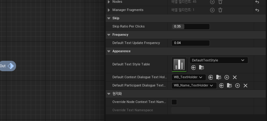
Clicking on an empty space on the graph will deselect the node and display the Details tab for this Dialogue Manager asset. What we need to look at is the Default Text Style Table property in the Appearance category.
This property determines the text style table used by default for nodes on the Dialogue Manager.
Change it to set the default text style table that the whole nodes in the dialogue manager will use as default.
Also, you can make the new dialogue manager aseets use your own specific text style table asset on the Project Settings -> simple dialogue editor setting. Check out there and change the DefaultTextStyleTable property.
Double-click on the DefaultTextStyle asset to modify it.
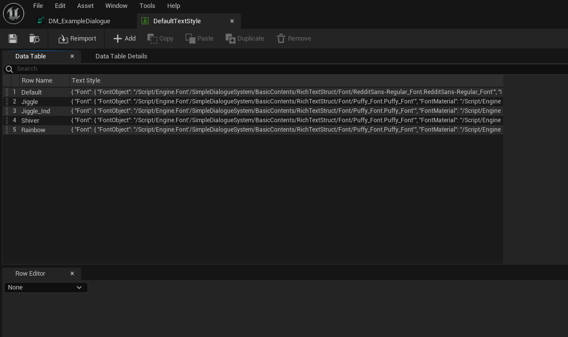
When you open the table asset, you'll see columns for each style definition. Let's add a new column to create our style.
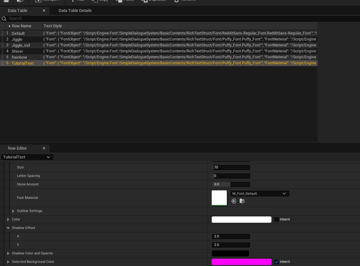
I named the row to TutorialText, set it to use the default Putty font with a size of 70, and added a shadow offset of (2,2). After saving this table, close and reopen the Dialogue Manager editor.
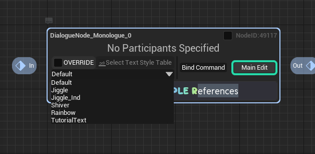
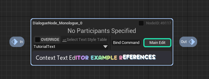
Then, if you open the text styling ComboBox again, you'll see the style we added, and selecting it will apply the style.
Overriding Text Style Tables
Sometimes you might want to use a specific text style table for each node. That's where the text style table override feature comes in handy.
Click on the checkbox labeled OVERRIDE.
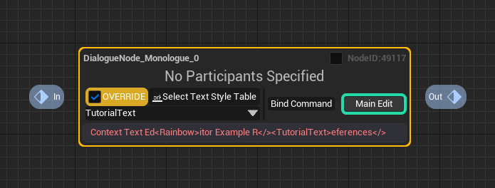
By doing so, all the previously applied text styles will be removed, and the text will be styled using the default NULL text style in red. Don't worry about it. This happens because we have detached the default text style table of the Dialogue Manager that was applied to this node and made it use an override text style table for styling. However, we haven't specified which text table to use yet, resulting in the default display with NULL text style.
Now, let's use the selector next to OVERRIDE to insert a new text style table. Click the Select Text Style Table button...
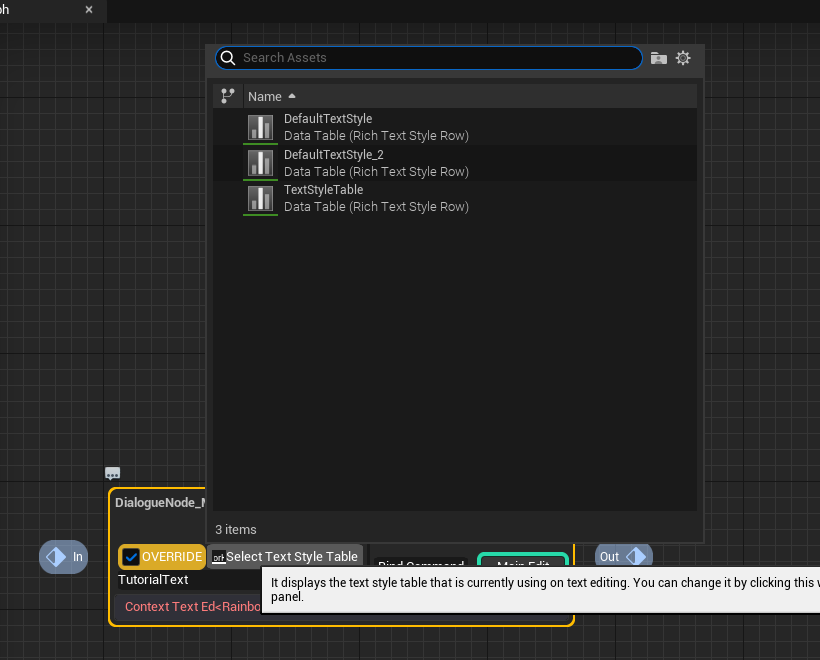
You will see the available text style tables. Now, choose a new text style table to use.
In this example, we'll reuse the default provided table.
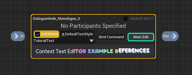
Now, you can see that the text is styled with the new text table's style data.
Explore Direct Edit Mode
Sometimes, due to plugin errors or user mistakes, the text style decorators might get tangled. Or, you might want to specify text styling directly. In such cases, you can click on the Main Edit button.
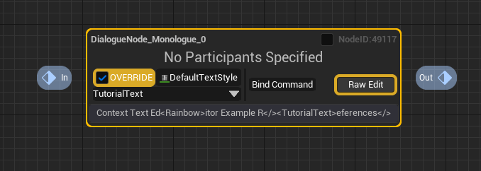
You will see all the markup decorators of the Rich Text styling displayed directly as text. Here, you can modify the text as you wish to change it to your desired style.
You can exit direct edit mode by clicking the Main Edit button again.
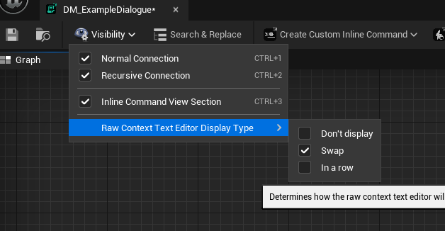
If you find it cumbersome to click the button every time to switch to direct edit mode, you can change the Raw Context Text Editor Display Type in the toolbar's Visibility section to In a row.
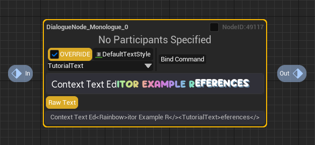
This way, the direct input mode text block will be constantly displayed at the bottom of the node.
Additionally, you can hide the button to switch to direct input mode by selecting the Don't display option.
Dialogue Text Holder Widget
Stylizing With Custom Text Holder Widget
In SDS, the context texts are usually used while wrapped with Dialogue Text Holder Widget, and you can style the text holder widget to change the visual of the texts further.
Every contexts in the system has the property named Should Override Dialogue Text Holder Widget Class and Override Dialogue Text Holder Widget Class, and you can change the class that we will use on making the Text Holder Widget by those property.

Let's make a new Text Holder widget for the texts and make it use that.
There is a sample text holder widget WB asset named WB_TextHolder on the path /SimpleDialogueSystem/BasicContents/Widget/WB_TextHolder
And we are gonna use it as a starting point of the tutorial. Let's duplicate it, and name it to WB_Tutorial_TextHolder
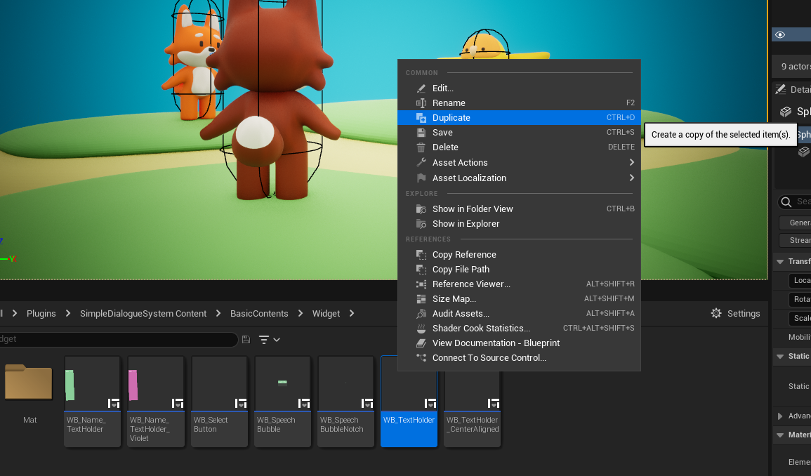
And let's change the visual of it a little bit. I just changed the border's design to have rounded corner and text's alignment to center from left.
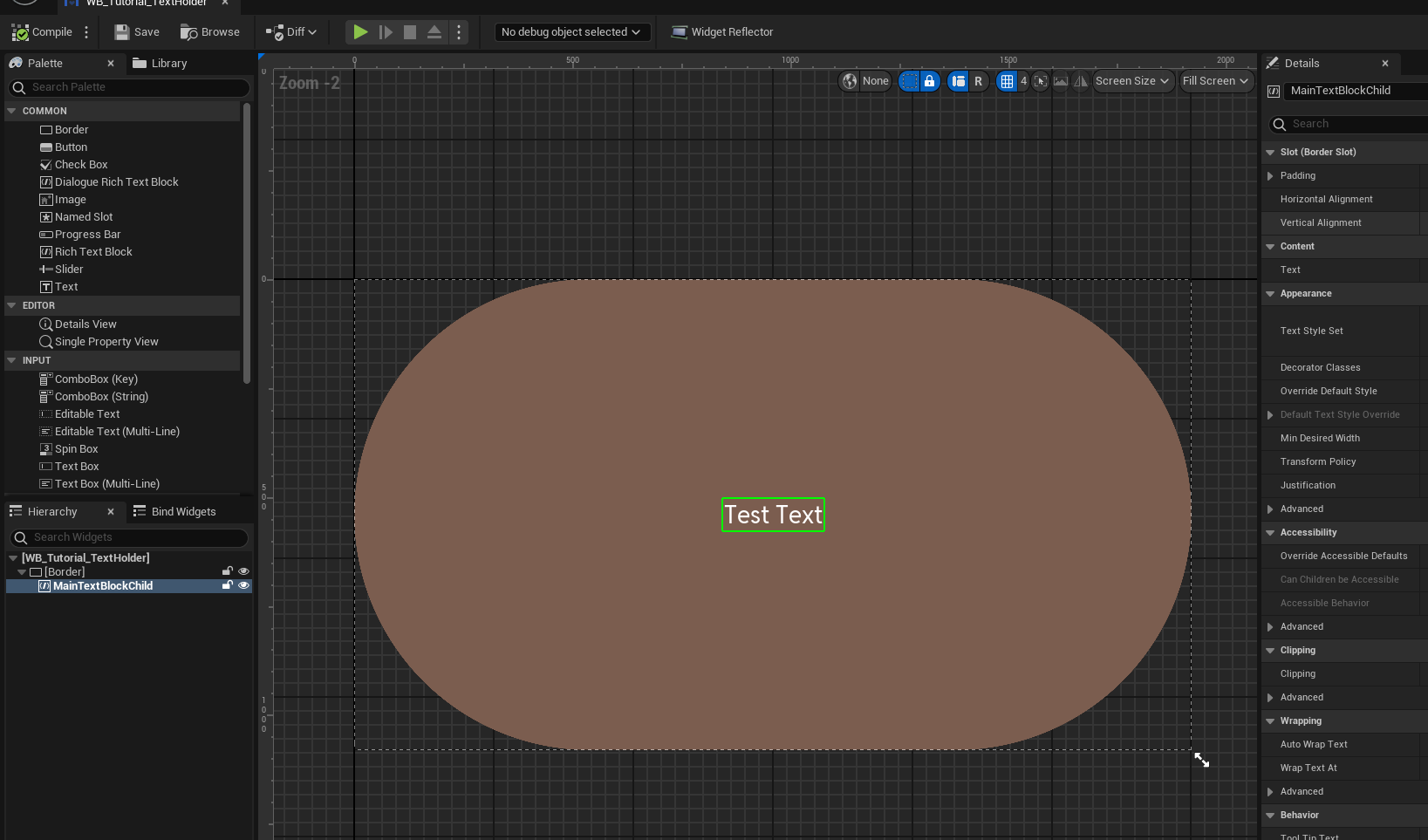
And let's put the class we made to the Override Dialogue Text Holder Widget Class property on the context section.

Then you will see the text is now wrapped in the brown and rounded box we just created.
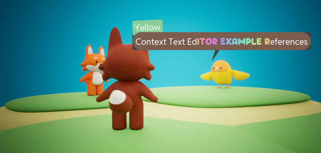
Alternatively, you can even decide to not display the text at all by enabling Should Override Dialogue Text Holder Widget Class and don't specifying anything for the Override Dialogue Text Holder Widget Class. It will be useful at certain occasion.
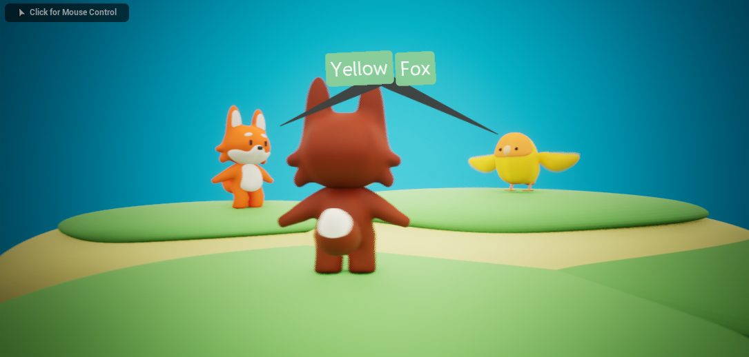
Just like the Text Style Table does, it also has default class property on the dialogue manager.
Change it to change the default widget class that the whole nodes in the dialogue manager use.
